So I tried making this point before with only words and it didn't work so this time I'm going to do it with pictures.
IMO; some of the default colors for the one way arrows are fine; blue for marble works great. It's clear and contrasts well with the terrain colors. But some are awful; take a look at my example pics and you tell me which one looks better. (or more importantly; which one is easier to see)
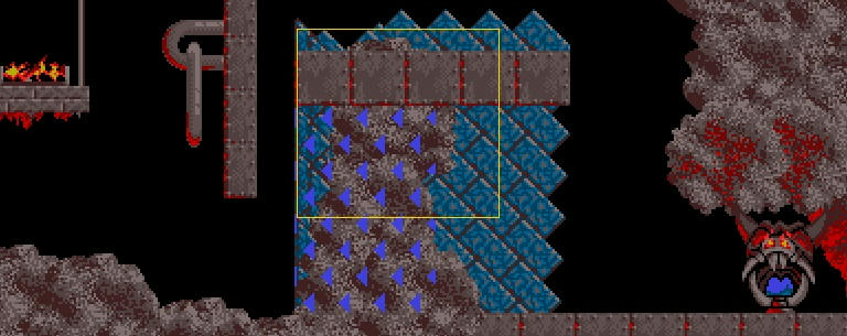
First is the default for fire:
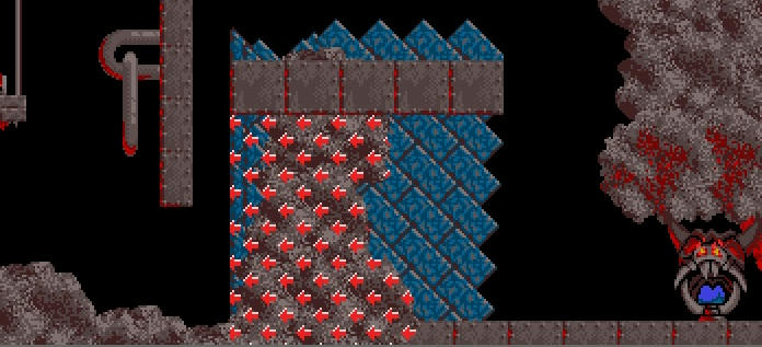
this is another (red arrows from a L2 set, Egyptian I think)
Here is the default for rock:
now here's a a brown colored set (from one of Gronkling's sets)
--------------
I know it's now possible to add any arrows you want thanks to the new formats and I appreciate that but it's still an issue because sometimes the only thing I can find to work really well, to stand out is an odd graphic set that not everyone may have or it might be a graphic set that doesn't get updated because the person might not be around anymore. And I don't really like the idea of having a level that's only a rock level for example except for this one part of the level, the arrows being from some other random tileset and having someone unable to play the level because they didn't download that style for that tiny purpose. The other method I had of solving this problem was changing the theme of the level to another set but this has the downside of changing other things like the color of builder bricks which does not necessarily look good. Not to mention that it's just FAR EASIER if the damn default color looked good in the first place.
The color ideas I have come from Lemmini; I don't know who or why they changed the colors when making Lemmini but they made excellent choices as all of the arrows stand out really well and look really good imo. The key is to pick colors that contrast really well and can't blend in easily with the terrain; so essentially try to pick a color that doesn't exist anywhere else within the set already, or not very much. Look at the crystal set for example; the red arrows stand out (and people have commented on how good they look in the past) exactly for this reason.
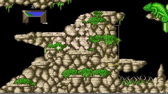
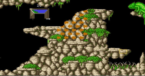
Look at this example for the bubble set:
https://youtu.be/ylzQwaNRkgk?t=491IMO the red looks FAR better than the pale default color from original Lemmings.
So here are my proposals:
marble: no change needed
pillar: change to blue the pale doesn't stand out so well especially on the lighter yellow blocks
fire: change to red?*dirt: no change needed
crystal: no change needed
brick: change to yellow the pale color doesn't stand out at all on the pale/grey blocks and chains.
bubble: change to red the pale doesn't stand out so well on some of the lighter pieces
snow: no change needed
rock: change to brown or yellow some of the L2 sets maybe could use a change as well but I haven't really looked into that too well yet. Many of them like Egyptian are okay imo.
*this one may be rather tricky actually because the fire set contains both a lot of blue and red but thinking about it I'm not sure what other colors would look alright in it. But imo; it's a pretty clear winner for red in that image above.
Now if everyone still thinks no change is needed or doesn't approve of any of these choices; can we get some kind of better way to choose our own color; without changing other things in the level??
 Poll
Poll